📅 WEEK 2 - 3 : 09.04.2021 - 16.04.2021 Lee Shu Wei 0345494
Design Principles Weekly Exercise 2 : Emphasis, Balance, The Golden Ratio, Rule of Thirds.
Design Principles Weekly Exercise 2 : Emphasis, Balance, The Golden Ratio, Rule of Thirds.
📑 LECTURE
This week, we learned about emphasis, balance, The Golden Ratio, and Rule of Thirds. Based on my understanding from the lecture, emphasis basically means from the word "emphasize", which is like highlighting important points in our notes, in order to make us pay extra attention to the point. Generally in design, the purpose is to create dominance and focus, to emphasize on the message. Dr. Jinchi mentioned that space plays an important role in creating emphasis.
For balance, there are two types of balance, which is symmetrical balance and asymmetry balance in general. Symmetrical balance can be achieved by imagining an invisible line at the middle, and balance both side equally. Specifically, this is called bilateral balance. Radial balance can be achieved when we arrange elements equally around a central point. Another kind, which is when design looks bilateral balance but not exactly mirrored, yet balance, is approximate symmetry. Besides all the three specific types of balance in symmetrical balance, asymmetrical balance is another type of balance which we can't really "fold" the image to make it looks balance, but by involving objects place in a way where visually looks balance. For example, imagine a see saw, placing an adult at one side, two kids on the opposite side to make the see saw balance.
Dr. Jinchi also introduced us two composition, The Golden Ratio and Rule of Thirds. As a Mass Comm student, I am familiar with Rule of Thirds. Rule of Thirds is common in film making and photography, which is dividing an image into thirds, using two horizontal and two vertical lines, and place the key element object at one of the points. The Golden Ratio is like a complicated version (not to say complicated, but like leveled-up version) of Rule of Thirds, which mostly exists in our nature. Basically, from the mathematical perspective, we just keep on dividing the space into half, and join the lines from one edge to another, then a spiral will be seen as Figure 1.1:
:max_bytes(150000):strip_icc():format(webp)/GettyImages-651240376-645f9422a1684adbaea17576261113e5.jpg)
Figure 1.1: The Golden Ratio
My personal hand-written notes:

Figure 1.2: My Personal Hand-written Notes
💡 INSTRUCTION
💭 EXERCISE 2
This week, we are going to create two designs in A4 size as usual, one for emphasis, another one for balance. The materials needed are pencils, colour pencils, colour pens or markers. This gives me a lot of freedom in designing, compared to last week which only black and white papers is allowed. However, this increased the difficulty as well. Sometimes, "Less is More". The freedom given tends to make me overthink, and makes the messages of my designs not straight forward and catchy enough.
To be honest, I tend to confused in between Contrast and Emphasis. I'll explain this further in coming paragraphs.
Visual Research & Idea Exploration:
I started off by exploring Instagram for emphasis and balance, mostly from my favorite photographers.

Figure 2.1 achieved emphasis by using the the difference of value and colour of the light in the middle compared to the surrounding. The sentence "Lost in Moment" creates extra mood to the entire photo, which emphasize on the entire message: "follow the light in the dark". I like the sense of hope in the photo. Meanwhile, approximate balance can be applied in this photo as well. I like this photo as the message is emphasized clearly, and it inspired me to design something to deliver messages like hope, a spark of light in the darkness, good on the inside...which are all very personal to me.
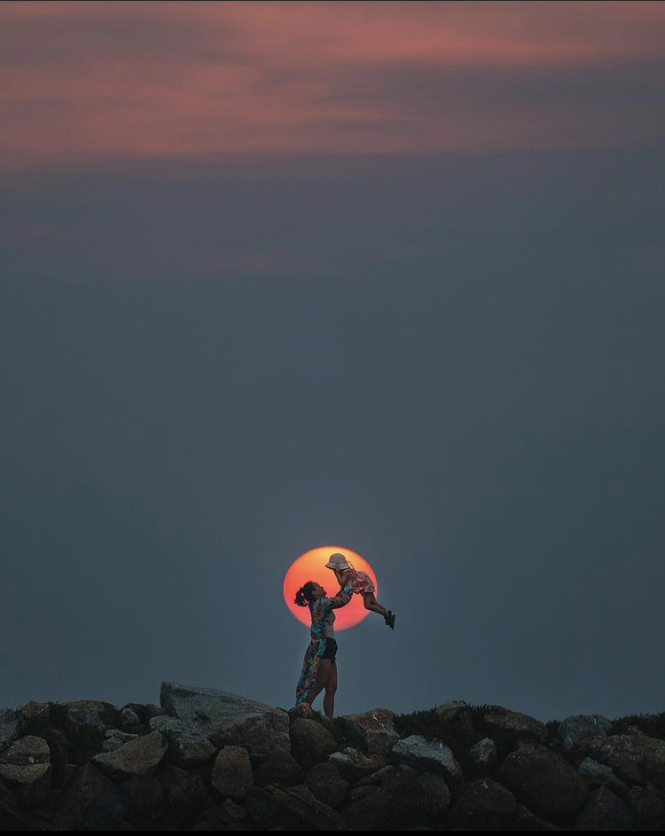 `
`Figure 2.2 achieved emphasis with the focus point of sun behind the mother and child. It makes me feel like it is emphasize on mother love. From this photo, balance is also achieved. This reminds me of Dr. Jinchi mentioned that most of the design are balance in a way, either symmetrical or asymmetrical, so that our eyes feel comfortable watching it. The circular focus point of the sun reminds me of my terrarium (Figure 2.3), which inspired me again about "good on the inside".

Figure 2.3: My terrarium


Figure 3.1: My 1st draft for emphasis
- Emphasis 1: Lost in the world of algorithms.
- Emphasis 2: Good on the inside, inspired by my terrarium.
- Emphasis 3: Another idea for good on the inside, but inspired from me eating oranges.
With the existing ideas, I noticed all of them are not strong enough for emphasis. At the same time, they are too messy. This is the time when I noticed I kind of messed up in between contrast and emphasis, especially when colours is allowed. I tend to create contrast by using complementary colours, or in contrast with the neutrals. All the designs are not really able to emphasize on my message. Thanks for the Tuesday tutorial class which managed to drag me back to the topic.
Meanwhile, I kind of bias towards Emphasis 2 and 3. So, I decided to further explore Emphasis 2 for Emphasis, and Emphasis 3 towards Balance.
💬 FEEDBACK 1
In Tuesday tutorial class, Dr. Jinchi advised me some ideas for my existing ideas:
- Emphasis 1: Instead of using portrait, I can try to use landscape as it will be more successful with more space, in order to achieve my goal for emphasis and deliver my message better. Maybe I should try from top view, the girl lost among in the pool.
- Emphasis 2: My design for this is too busy, especially with the different directions of lines. I need to be more careful on the usage of colour inside the circle. Preferably clean typeface at the center, somewhere above the writing of "bloom" can use some floral elements to focus on the theme.
- Emphasis 3: I can make use of the "oo" in the word "good" as oranges. The arrangement of "on the inside" can be in a line.
After that, Dr. Jinchi provided us feedbacks for our exercise 1:
Here's my feedback to your Design Principles blog and Exercise 1 (Contrast & Gestalt): The blog is complete with the required components all in. You describe clearly your understanding and reflection of the week. You have done a substantial amount of exploration of ideas, crucial for producing a successful design. The description of your ideas in the blog makes the reader understand your purpose and your design intentions. It makes it easy for the reader to see how you arrived at your final designs. The additional narrative you included into the designs, explaining the meaning behind them makes the designs more interesting. The final outcomes for contrast and Gestalt (Figure-ground) are well represented and have neat, good finishing. Keep on the good work.
After the tutorial class with the feedbacks I got, I moved on to my 2nd draft.

Figure 3.2: My 2nd draft for emphasis and balance
- Balance: This is the improved version from Emphasis 2. Initially as stated above, I mentioned that I want to further explore Emphasis 2 for Emphasis, Emphasis 3 for Balance. However...I feel like changing my mind and make it balance instead. Specifically, this is an asymmetry balance, not exactly a radial balance although it's in circular arrangement. The sentence "good on the inside" placed inside the middle, serves it purpose as like the sentence it self. I've decided to use century gothic in bold because it's neat and simple, because the flowers itself are complicated, so in a way, is to balance the overall design.
- Emphasis 4: This is the improved version from Emphasis 3. It will be for emphasis. The different sizes of green citrus (lime) will be the background, the four orange citrus (orange) will be in same sizes and arrange aligned. The word "good" , I can actually see four circles instead of two "o". I think this is a good idea to emphasize the 4 oranges by using the different of colours, sizes and arrangement.
 Figure 3.3: Visual samples for my 2nd draft
💬 FEEDBACK 2
After that, I asked Dr. Jinchi for some feedbacks regarding to my latest ideas. She provided me feedbacks as below:
- Balance: It is way better than the initial ones so, yes, please go ahead with it. Just be wary of the space at the top and bottom of the frame. Give it some space so the design is not cramped up. Make sure the typeface is not too slim.
- Emphasis: The background of the original Emphasis 3 looks more dynamic but it is hard to show emphasis because the type would be drowned by the background. Hence, your latest Emphasis 4 is a better idea. Make sure the oranges are smaller and spaced away from the word so that further helps to enhance emphasis. Although in the colour wheel and theoretically green and orange are not complementary colours, due to the different variations, these two colours may clash and fail to create emphasis. So before you produce the final design, do explore with colour combinations.
From Dr. Jinchi's feedbacks, I got to know that my attempt to make use of the colour of orange and green might not work out well for emphasis. Besides, it really makes me want to know more about colour, which is interesting. At the same time, thinking about the idea for emphasis, I agreed with Dr. Jinchi's feedback regarding to the space. From that, I proceed to another draft for emphasis:

Figure 3.4: 3rd draft for Emphasis
I decided to include the “on the inside” so that showing the inside of citrus only make sense. For the colour, I thought of using blue, but it also means I need to change to other fruits, which I didn’t want to. So, I decided to keep the big yellow lemons like a frame out there. For the centre part, which is the one I wanted to emphasize on, it will be as like previous sample photo shown, tone from red to orange, mid section of citrus in details.
💬 FEEDBACK 3
Dr. Jinchi provided me feedback saying that she thinks the top left composition is the most suitable because there are variations of the orange slices. Besides, I can still afford to enlarge the "good" a little more.
With all the feedbacks collected, I proceed to work on the A4 papers:

Figure 4.1: Trial of colours for Balance

Figure 4.2: Trial of colours for Balance

Figure 4.3: Pink colour pens out of stock
But it's okay, thinking of the good side, the situation allowed me to try out different colours and explore more! From the trial process of colurs as shown in figure 4.1 and 4.2, I managed to figure out the combination of colours and floral elements that I want. Besides, this stage of jotting down colour code of my pens helped me in identifying the colours that I have chosen. This step is essential for me, not only to this exercise, but also when I need to work for mood boards and proposals for other works. Then, I proceed to sketch them out with pencil, and fill in the respective colours:

Figure 4.4: Sketch for Balance
Video 4.5: Snippet of me filling in drawing for Balance

Figure 4.6: Drawing for Balance

Figure 4.7: Completion of Balance
Are you wondering how I am able to get the exact bolded Century Gothic font without printing out or edit in? Answer: I placed my paper on my laptop screen, and traced it.
After that, I proceed for Emphasis. Nothing happened, but I had some new ideas again when I was looking on illustrations for citrus. I decided to add some elements at the focus point which is the sentence "good on the inside".

Figure 5.1: Sketch for Emphasis
I made 'g' and 'd' as whole orangs, with slice of orange aside. Besides, I made the tails of both alphabets be like stem, with leaves. I feel this can emphasize at the whole message more accurately, and add more attention to it.
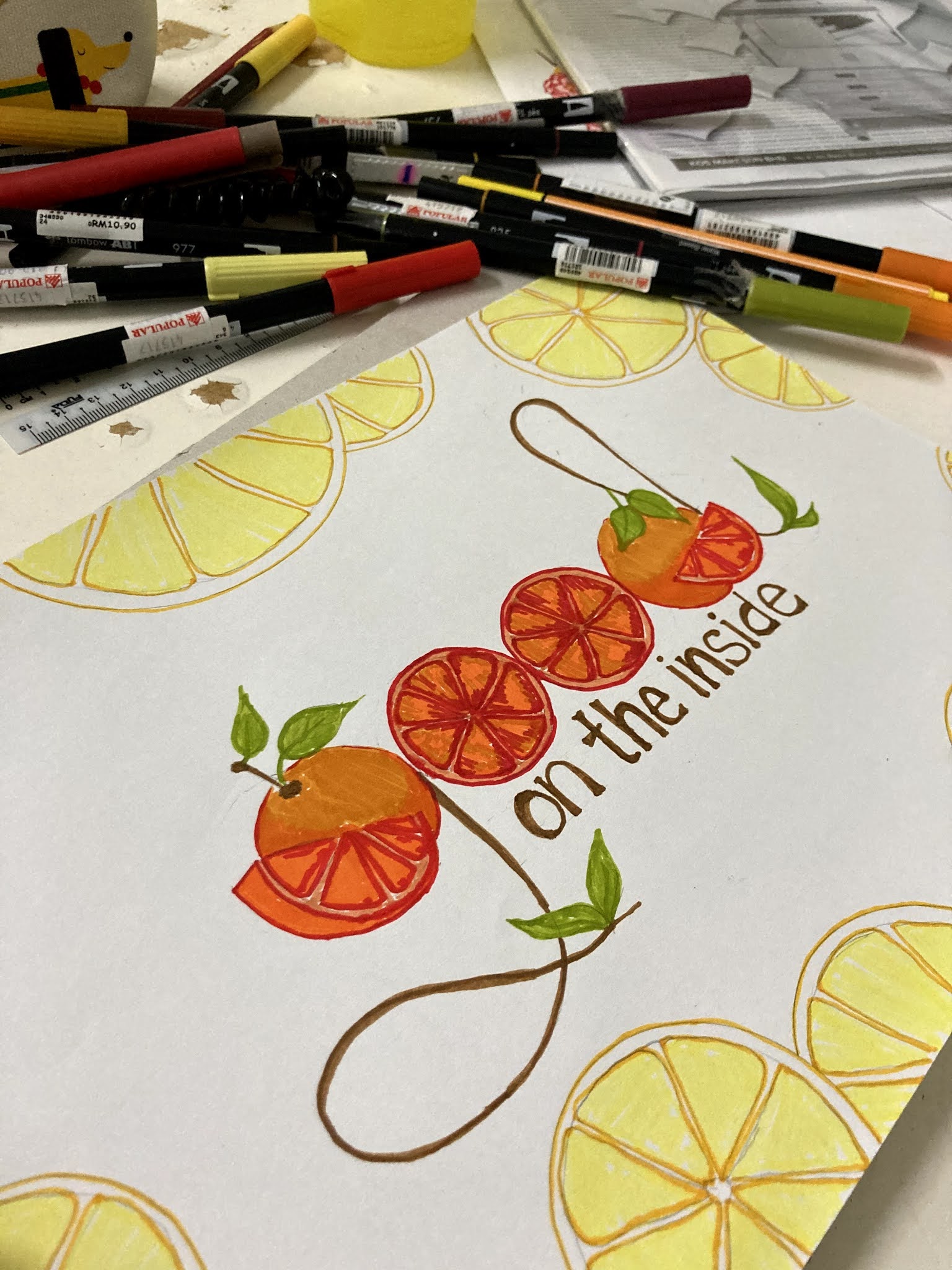
Figure 5.2: Completion of Emphasis
Figure 6.1: Balance
Figure 6.2: Emphasis
💗 REFLECTION OF THE WEEK
Overall, this week's topic is interesting for me. Unexpected issues sometimes lead us to learn more, and enable me to learn from mistakes, and try out more challenging stuffs. For example, asking for more feedbacks enable me to understand a little bit more about colours, unable to get my favourite colour-pink enable me to step out from my comfort zone, try and play with "new" colours.
To be honest, stepping into week 4 makes me kind of excited, but at the same time worry as well. Worry about what? Time management. This is definitely my responsibility as a student. I feel I can actually explore more ideas...If I would rate my satisfaction for my final design outcomes for this week, I would say rate 5.5 out of 10. I wanted to rate a 5, but that 0.5 is for me completing it with my whole heart. I REALLY enjoy doing these, but at the same time need to juggle other modules, distribute my time evenly is currently a problem for me. I wish I can have a whole semester with only design related modules, so every session working on them will be like therapy.
Okay, getting into a more serious reflection. Definitely, I learnt a lot from this class, especially with such a kind and patience lecturer. I was so guilty not being able to present my best for this week Tuesday's tutorial class. My progression slowed down in comparison to last week. But, Dr. Jinchi is very understanding. I have to mention that her feedbacks, really help a lot. Not only for designs, her feedbacks are like motivation for me, driving me to produce better works. I thought she was going to be on fire when most of us did not manage to update our blog with more progression.
"Good on the inside" is actually my recent favourite sentence. It's like a reminder to self, no matter what I am doing, see the good on the inside, and inside myself as well. One of the reasons falling in love with this class is because it constantly reminds me to stay present and grounded, and be aware of my surrounding, I love how I am able to say something through a piece of paper. Although for the both designs, people might think it is just a simple drawing, especially for the balance. People might feel that it is just a flower frame with a sentence in there, nothing special. Well, I admit it is not outstanding, but it is extra meaningful for me, and it is now placed nicely in my plastic folder. I hope, one day I will be able to design something that can touch someone's soul, and tell me "I feel you". Ah yes, I am an emotional human...and I am proud of being sensitive and emotional in such way! Or maybe dramatic? Hey, it is a gift ;)
Alright! This is all for this week. I NEED TO CATCH UP NEXT WEEK'S LESSONS, SO THAT I CAN HAVE MORE TIME FOR IDEAS EXPLORATIONS, AND MORE TIME FOR TRIALS AND ERRORS, IN ORDER TO PRODUCE design that I can rate 9-10 out of 10 !!! Let's go.
Comments
Post a Comment